
Objective:
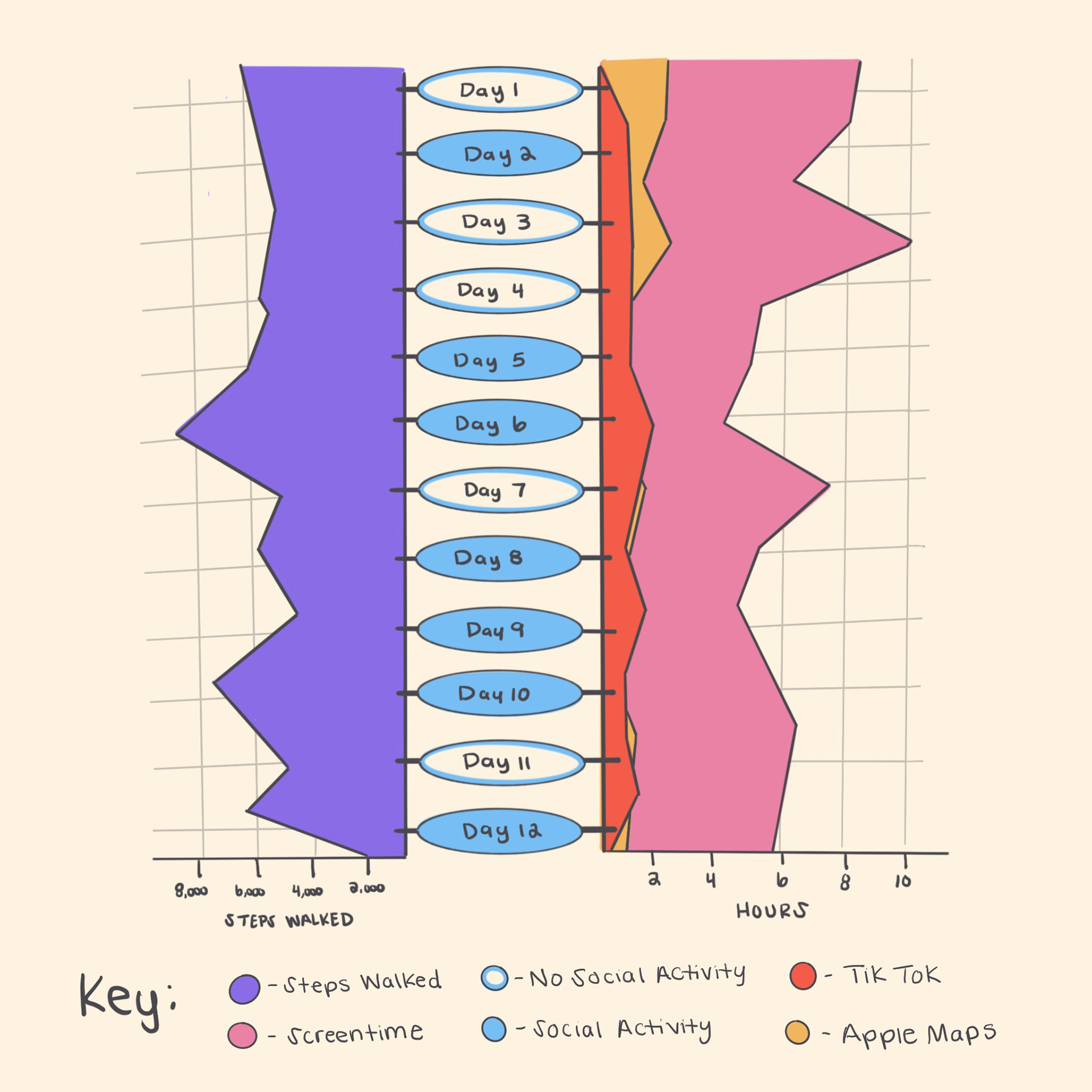
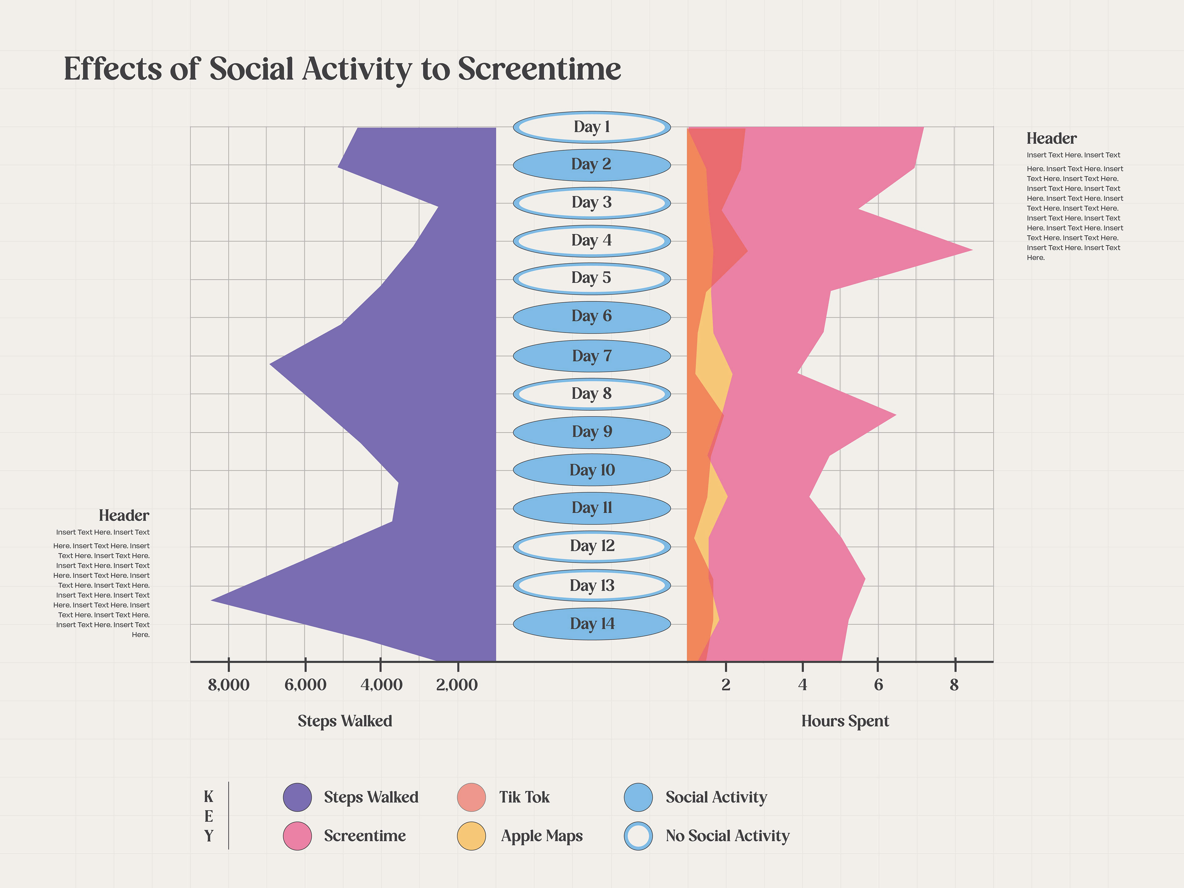
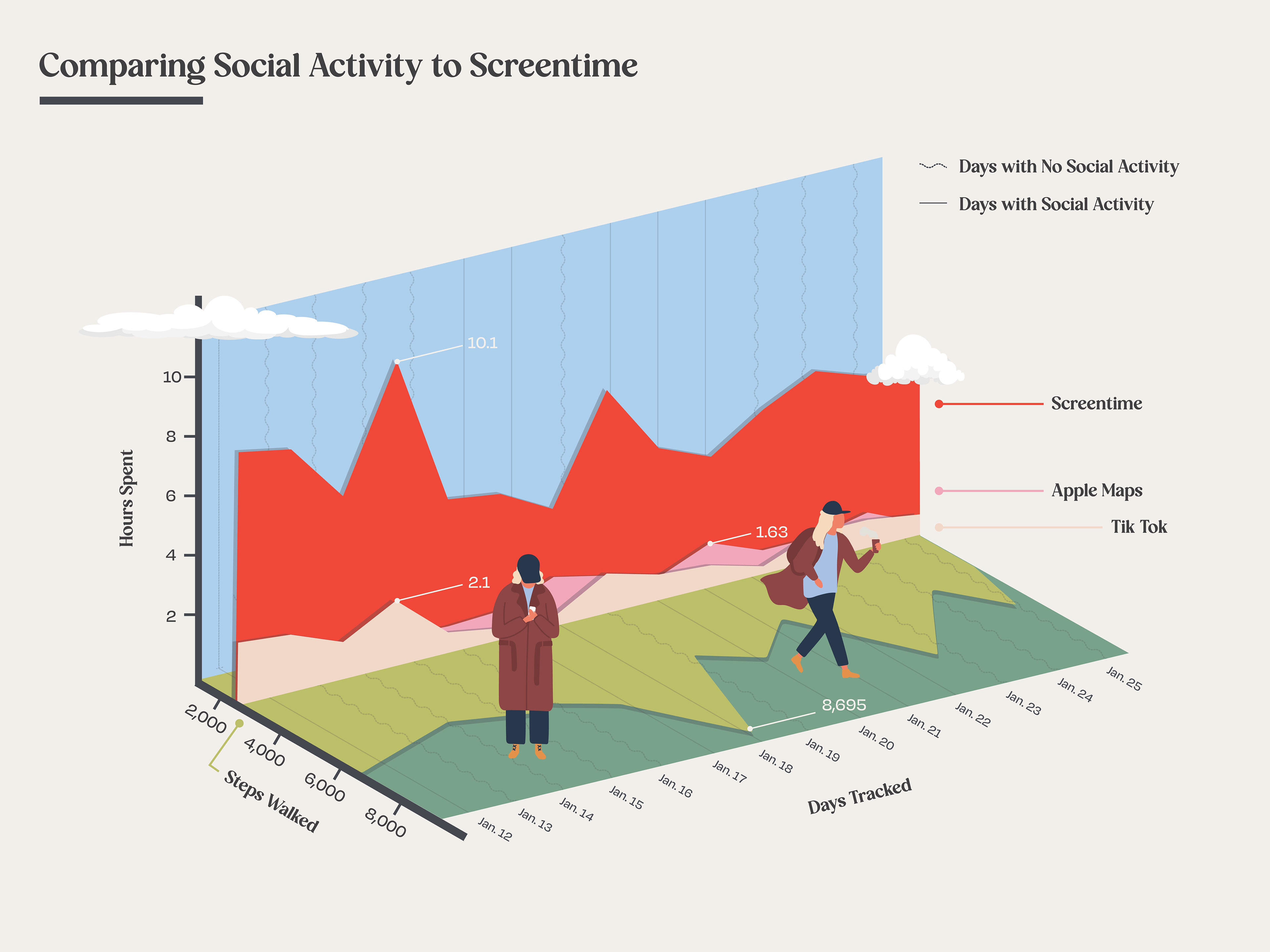
I created a data visualization poster depicting the steps walked, screen time, and most utilized apps during a 14-day timeframe, additionally analyzing and comparing days involving social interactions with friends versus days without social activity.
Data Collection:
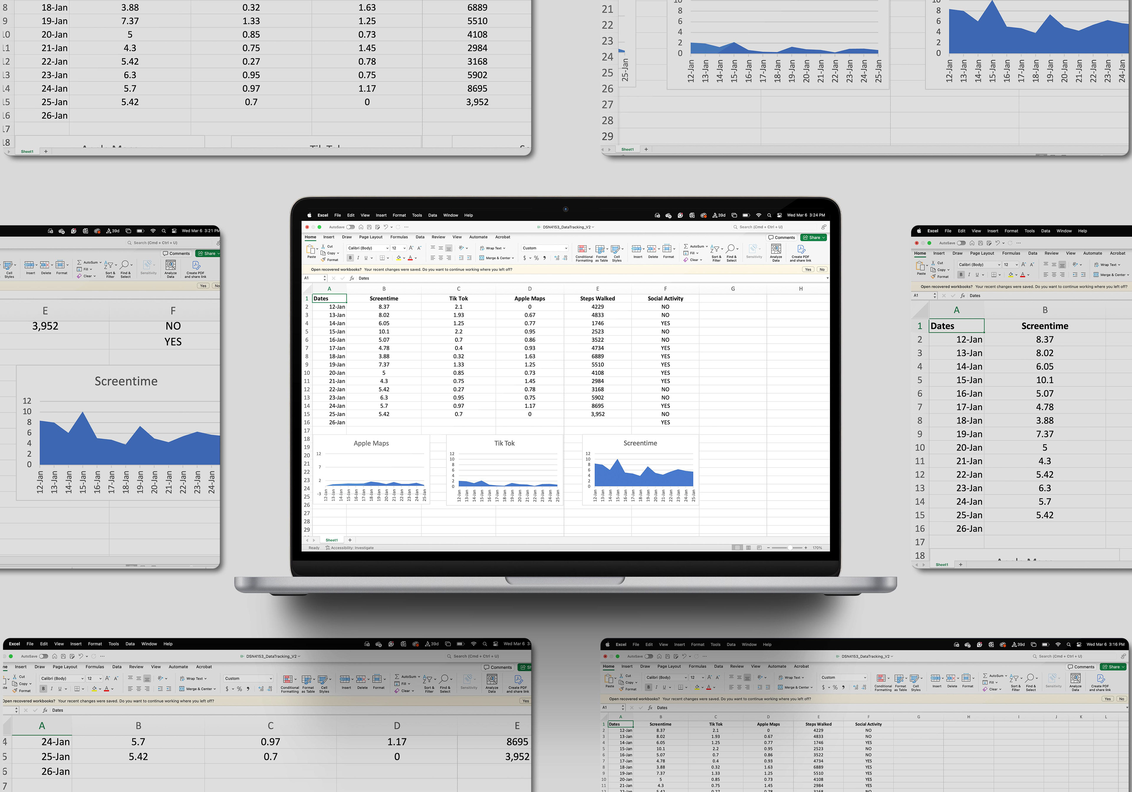
Data Point 1. Steps Walked: Tracked using Apple Watch settings.
Data Point 2. Screen time: Collected via phone screen time settings.
Data Point 3. Hours spent on TikTok and Apple Maps: Collected via phone screen time settings.
Data Point 4. Social Activity: Manually logged if I spent time outside of work/school socializing with friends.
(All data was collected during a 14-day period lasting from January 12, 2024 - January 25, 2024.

Data ANALYSIS:
An immediate observation I had when examining the data was the correlation between social activity, steps taken, and screen time. Days characterized with social activity tended to exhibit an increase number of steps walked while displaying a decrease in screen time usage. On the contrary, days without social activity had an increase in screen time and a decrease in steps walked. This correlation suggests that social activity may play a significant role in influencing physical activity and screen time habits.
The data shows the potential benefits of social engagement in promoting a more active lifestyle while also highlighting the tendency for increased sedentary behavior during periods of reduced social activity. These findings emphasize the correlation between social dynamics, physical activity, and screen time behaviors throughout my day-to-day.
DESIGN PROCESS:
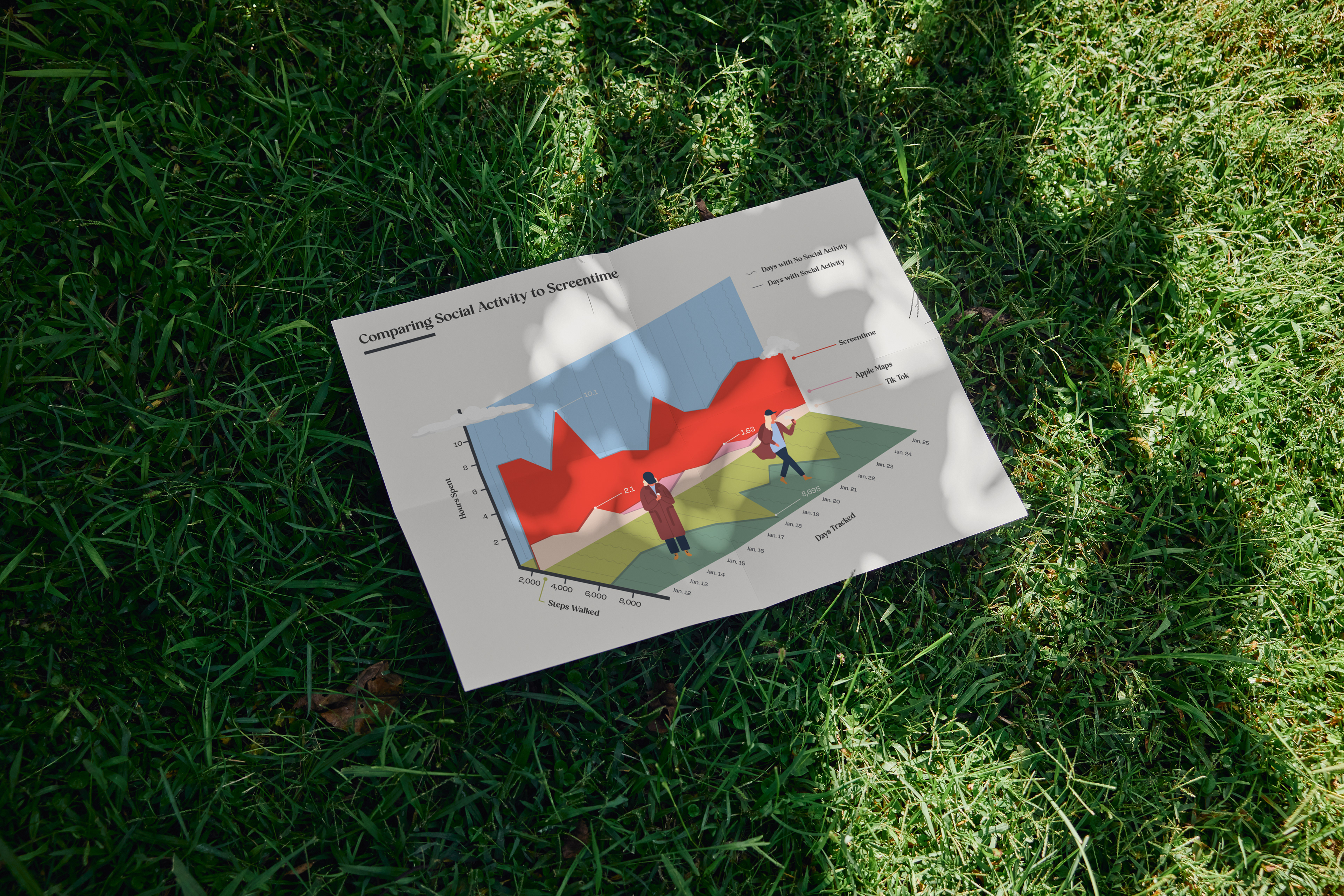
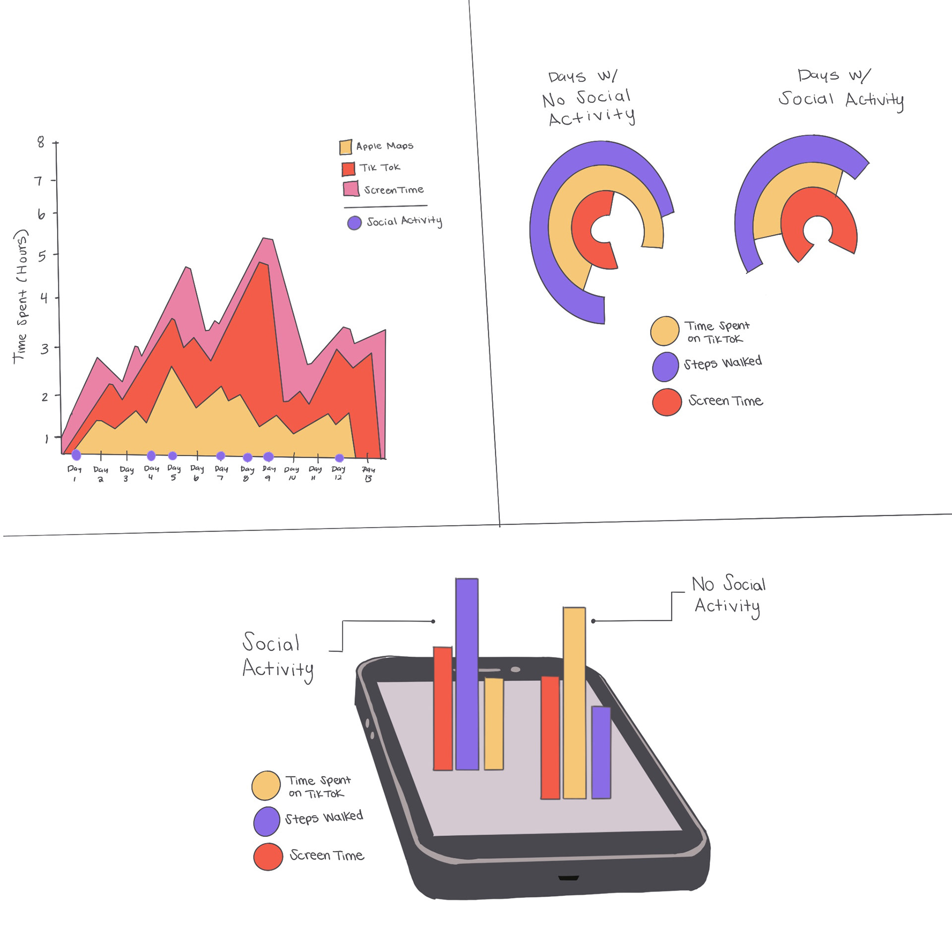
Concept Development: When considering the development of my design I had to keep in mind my main data points: screen time, apps most used, steps walked, and social activity/no social activity. Since there was a correlation between the data I wanted to visualize it within one graph. I found an area type graph most fitting.
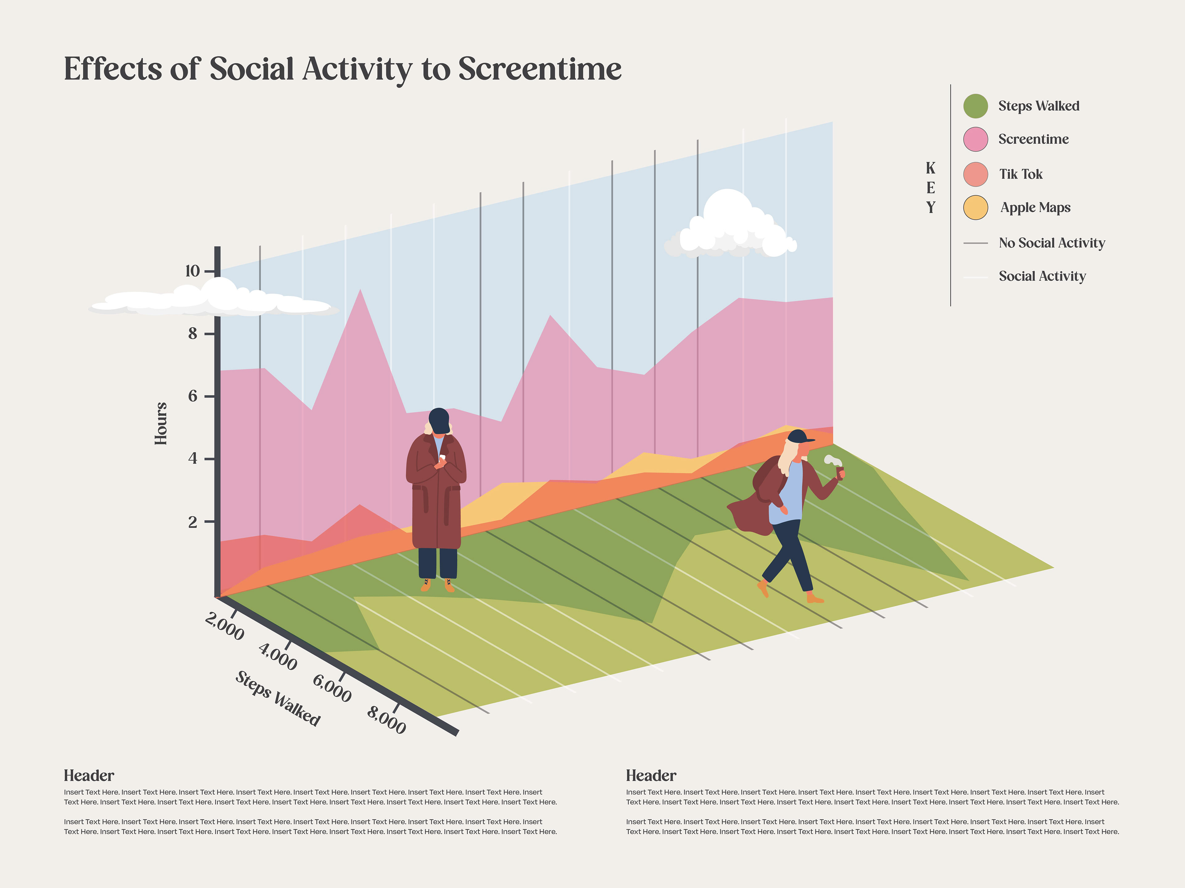
Iteration: During my original iterations I used a basic area chart to show my daily activities. I found this to be the cleanest way to display and compare my various data points. After creating a digital version of my area graph sketches, I realized I wanted something more engaging and personal. So, I updated it to a 3D visualization. Now, it includes illustrations of me walking and looking at my phone (depicting screen time). This allowed the data to tell a story about my daily life in a visually appealing way.
FINAL DESIGN:
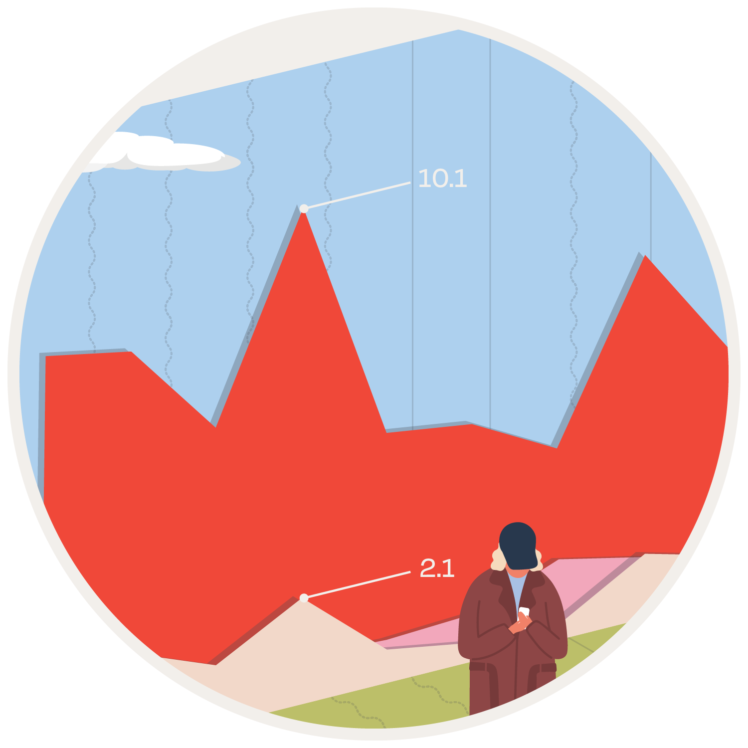
The final design is a 3D area graph resembling a landscape, complete with a sky and illustrated representations of myself. The design captures data collected over a 14-day period, including hours spent on TikTok, Apple Maps, overall screen time, steps walked, and the log of social activity each day. I visualized screen time and hours spent on TikTok/Apple Maps, with varying heights and shapes representing the intensity of usage. I also included data points highlighting the peaks for each measurement. My steps walked are depicted on the bottom/grass part of the graph, symbolizing the ground on which I walked. I displayed my data in such a way that the viewer can hopefully walk through the data landscape, and easily engage with my daily activities.
REFLECTION:
This project allowed me to understand what it means to truly visual data. It enabled me to experiment creative visualization techniques as well as integrate storytelling elements to enhance the data's meaning. Not only that, but I also analyzed my own data, providing me with insights on my habits and allowing me to identify patterns within my daily routine.